Most writers focus on creating a great book cover design, but good design principles for the inner pages are often ignored. This results in a poor reading experience for readers. That means you might end up with bad reviews of readers for your book just because you failed to design it properly.
You need to make sure your interior design is perfect if you don’t want to end up with bad reviews.
The layout and design of your book will entirely depend on what kind of book you are writing or creating. Is it an eBook or a paperback? Does it have images and illustrations or is it text-based only? Who is your target audience (adults or children)?
For example, if you are writing a novel for adults, then your book will be texted-based. In this case, you must design your text so that your pages look more appealing to the reader.
If you’re self-publishing your book, you must consider these vital aspects of the page layout.
Margins
Margins are the blank space that surrounds a body of text on every page, and it’s one of the most important elements of interior book design.
Every page includes inner margin (gutter), outer margin, top margin, and bottom margin.
When you open a book, the text looks like it is in the center of the page. This is because the inside margin (gutter) is always bigger than the other margins.
The size of the top and the bottom margins will depend on where you place your page information such as author name, book title, chapter name, and page numbers. Sometimes the page number is in the bottom margin.
Sometimes you need to include a bleed area that extends beyond the page margin or the printing area.
Bleed is an extra 0.125-inch area around all edges of the pages or cover of your book. Bleed is needed on any printed document that has any text or graphic elements that should go off the edge of the page or right up to the edge of the page. Basically, documents that have bleed print on oversized paper, and are later cut down to the right final size. The artwork “bleeds” off the edge of the page, hence the term.
This article helps you choose a trim size and suitable margins for your book.
Whitespace
Since printing costs are based on the number of pages you need to keep control of your printing costs or you will not be able to make a profit from your book. Some authors try to reduce the number of pages by reducing margins and line spacing, which creates a tight layout and makes their book crowded.
This method shows the professional design of the book and creates some aesthetic balance in the text.
Line spacing (or leading) improves the readability of the novel a lot. The choice of line spacing will closely depend on the font choice. Some of them are too tight, and the letters are so close to each other that a reader might even get a headache.
The common practice is to use 1.5 lines, which is also good for screen-reading. But normally line spacing should be between 1.25 and 2.00.
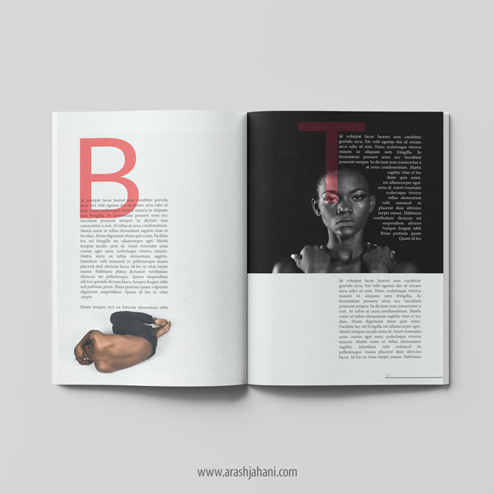
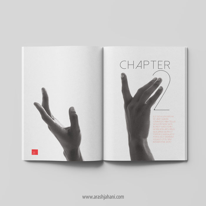
The sink is when you start your text almost in the middle of the page with a lot of white space above it. It is also a clever way to add white space in a book while signaling a change in your storyline. This area of white space is a great opportunity to add a little idea or graphical element. Also, you can use a drop cap.
A drop cap is when you use a large capital letter at the beginning of a text block or paragraph and it has the depth of two or more lines of normal text.
Also, In most professional books it’s not regular to use space before starting each paragraph.
Line Width
A key to great text readability is having the correct amount of characters in a text line. The line width should enable the reader to keep track of the words they read. There are two ways things could go wrong if the text line is too wide or too narrow.
This is important in large books or magazines, but in small-sized books like 6×9 or 5×8 inches, it’s not important.
If the text line is too wide, the reader will find it hard to focus on the text. It might be hard to get where it starts and finishes, especially with a big text block.
And if it’s too narrow, the reader gets tired easily when he needs to move his eyes faster.
It’s best to keep your text within 50-70 characters per line.
Typography
There are hundreds of fonts to choose from. But the best kind of them is to be readable and pleasing to the eye. The kind of typography that you choose totally depends on the type of book you are planning to create.
It’s important to choose the right typography since it represents your whole writing. There is a wide variety of fonts available, so it sometimes might be too hard to resist the temptation of choosing something different. Well, don’t do that. Standard fonts in publishing are Serif, they are classy and somehow traditional. Semi-serifs are more contemporary. Both of them make words more suitable to read. An appropriate choice of font size for most books is 11pt.
For example, most fantasy books use:
Minion Pro
Baskerville
Adobe Garamond
Trajan Pro
Oranienbaum
Images
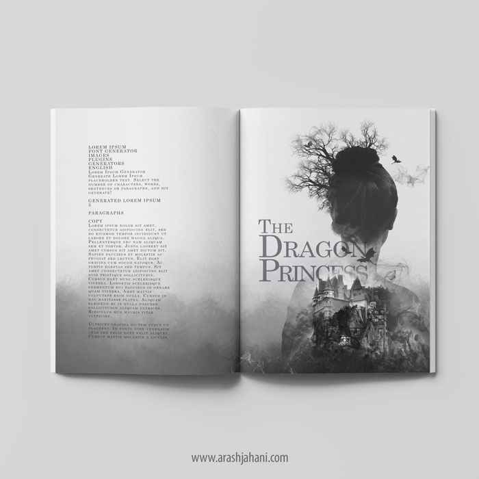
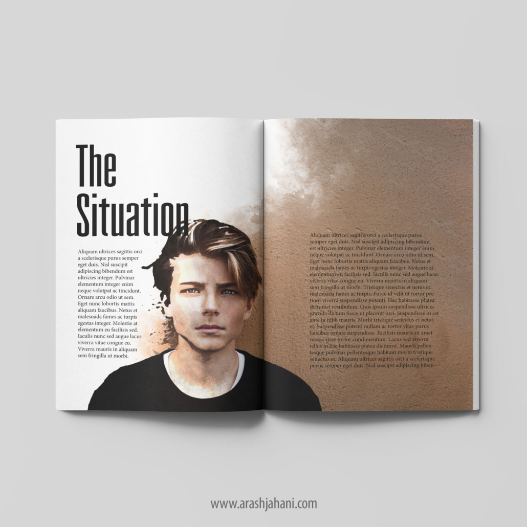
If you are using additional illustrations and images in your book, make sure they combine well with typography and text blocks. This means that the layout of the book must incorporate them properly so that the pages look beautiful and well designed.
For example, if you are creating a cookbook you may want to place the photo on the left page while having the recipe on the right page.
But it’s important to remember not to crowd all your images together. Let each image be part of the story that you are telling in your book.
Widows and Orphans
Widows and orphans are words and parts of the sentence that end up where they don’t belong. They compromise readability and create unnecessary negative space.
A widow is a word (or just a few words) that stands isolated at the bottom of a paragraph, column, or page. It makes the text structure look very unbalanced.
Orphans are words that stand on their own as a part of the paragraph on a previous page. Think about the subconscious reaction: you turn the page over only to find one missing word.
This makes your page layout look shabby. Secondly, it impedes the reader’s reading experience as it causes them to pause mid-paragraph.
To avoid this, you may have to rework your text layout which can be tricky. This can be done by reworking your text or adjusting tracking and kerning options in your layout software.
Tracking adjusts the space between a group of letters, words, or whole paragraphs.
Kerning will adjust the space between two characters.
By the way, it is not popular to use hyphenation in the manuscript.
Do you want to publish your book? and looking for professional advice for interior book design? feel free to contact me before publishing your book.


