Color temperature is one of the main topics and categories of colors that there are three indicators of color temperature;
Warm, cold, and neutral
The possibility of arousing people’s emotions can be controlled by distinguishing this color classification. Warm colors with shades of yellow and red; Cool colors are blue, green, or purple. Neutral colors include brown, gray, black, and white.
Warm colors
Warm colors are red, orange, and yellow and variations of these three colors. These are derived from the colors of fire, sunrise, and sunset, and are generally a symbol of energy, excitement, and positivity, and warm colors are used in designs that reflect passion, joy, enthusiasm, and energy. Warm colors make up half of the color cycle.
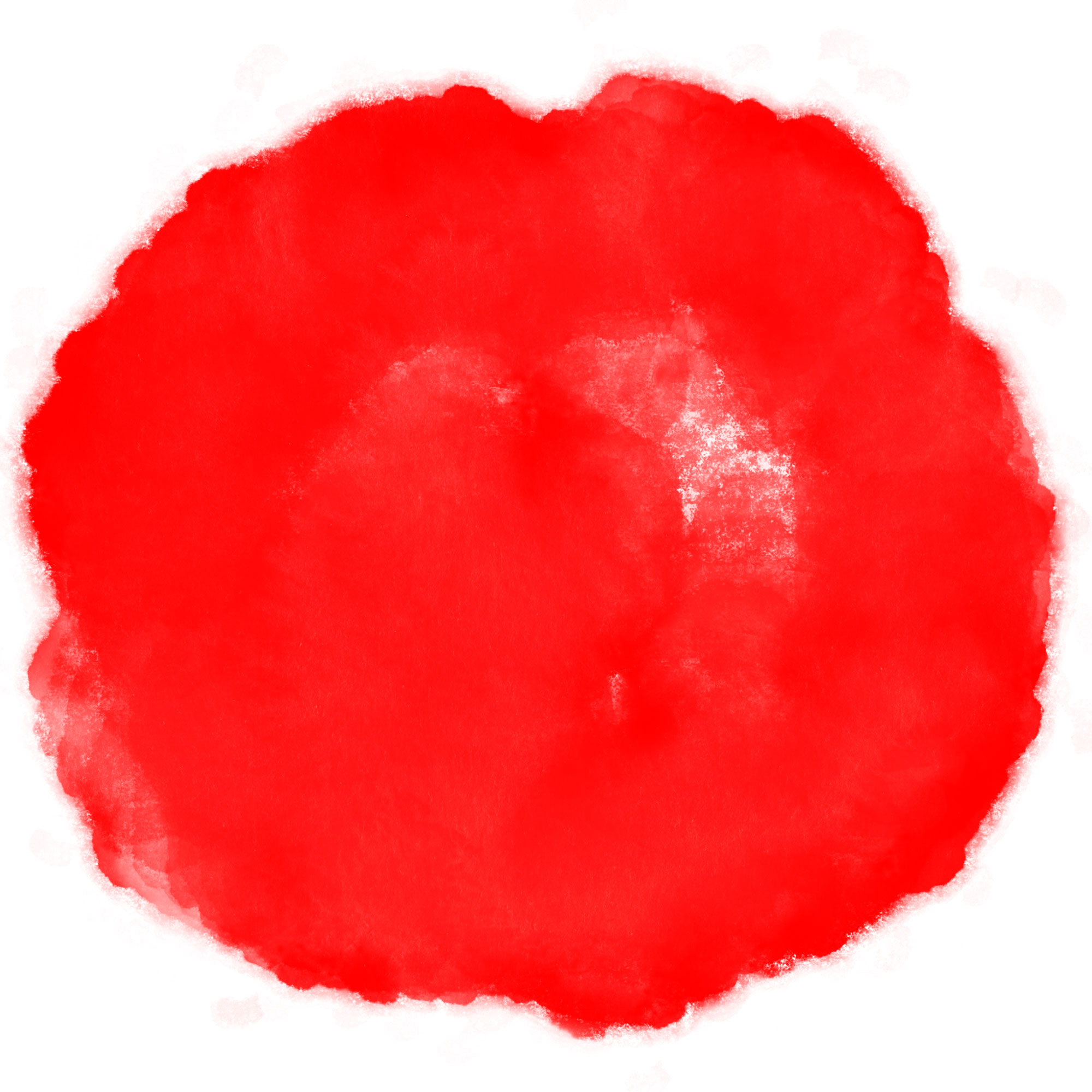
Red
Red is the warmest color in the color cycle. This color is associated with fire, violence, and war and is also associated with the concept of love and passion… Red has been shown to increase metabolism in the human body. However, red can be very diverse, and its meaning is different from lighter versions, darker shades.
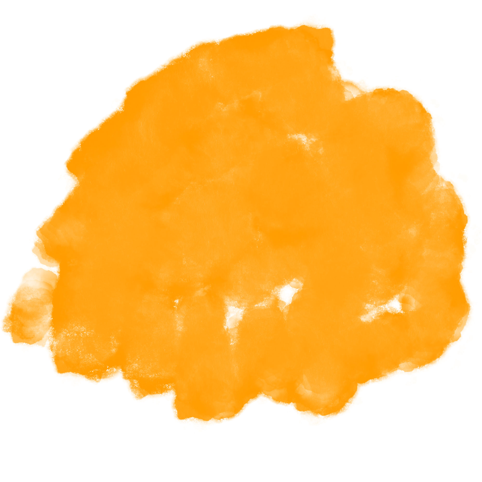
Orange
Orange is a vibrant and energetic color. Orange also shows changes and developments, orange is used to show creativity in book cover design.
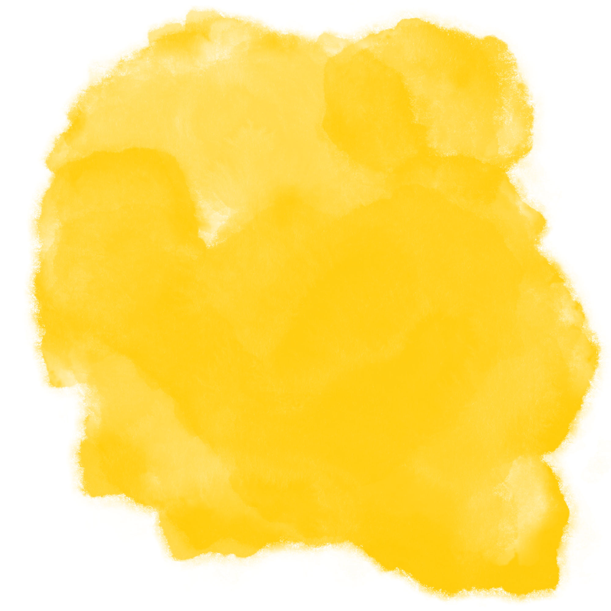
Yellow
Yellow is the color of hope. Yellow is the brightest and most energetic warm color. Even in some book cover designs, yellow has been used to express fear. Yellow is also with the concept of danger
Cool colors
Cool colors include green, blue, and purple. Cold colors are the color of night, water, nature, and are usually calm, soothing. Blue is the only major color in the cool color spectrum, meaning that other colors are created by combining warm blue with yellow to green with blue. Cool colors make up the other half of the color cycle.
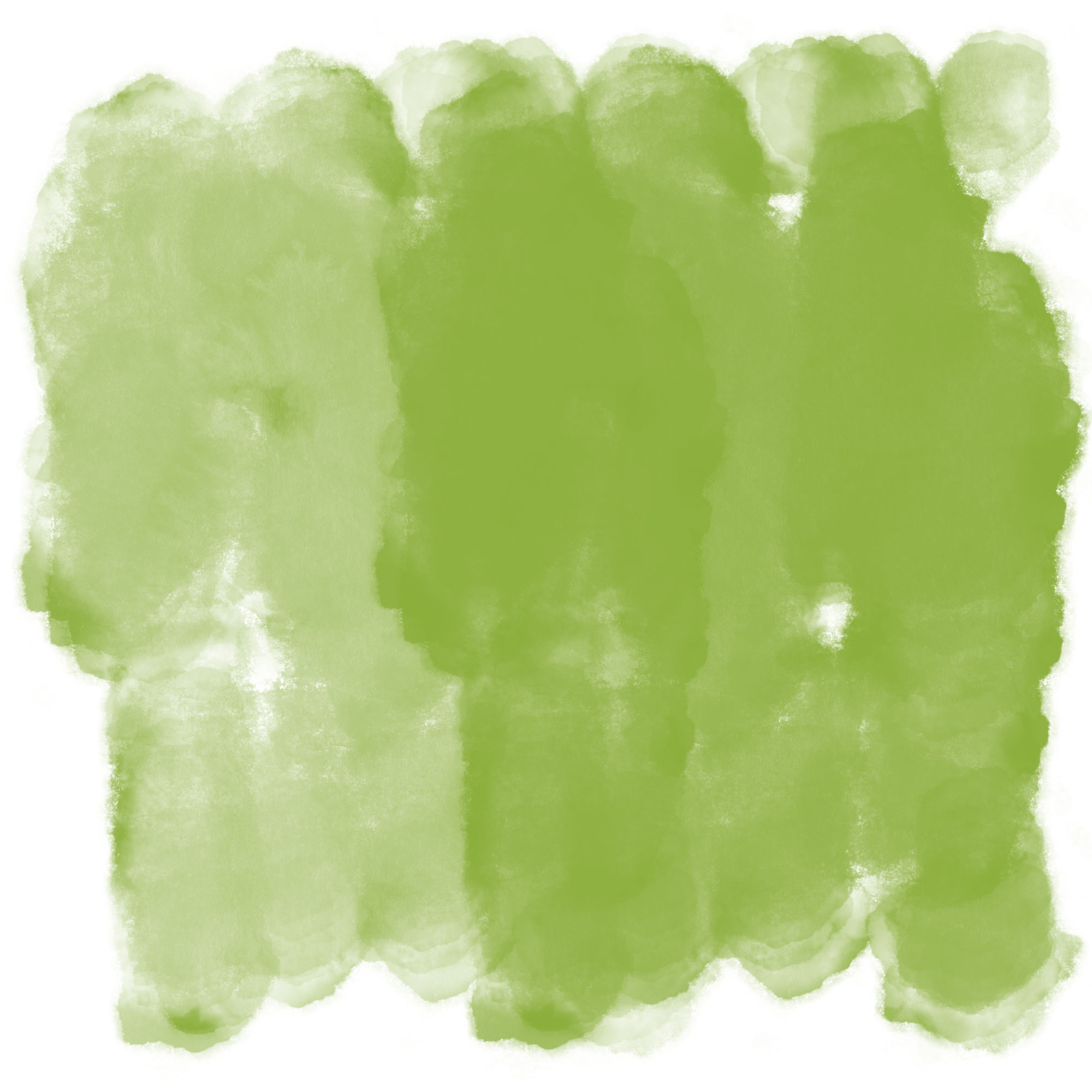
Green
Green indicates the growth and beginning. It also shows renewal and abundance.
In graphic works of green based on the meaning of beginning and beginning, the concepts of inexperience have also been shown to have good feedback, even at a time when most startups used more green in logo design. Green has many of the soothing properties of blue, but it also contains some of the energy of yellow. In design, green can be defined as balancing and coordinating. Green is also considered as the color of nature and receives this state and freshness from this concept. Light green has more energy and is more vibrant, while darker colors and spectrums of green, which is more inclined to olive, indicate stability.
Blue
Blue is also widely used to indicate calmness and responsibility.
Light blue is refreshing and friendly, while dark blue is strong and reliable. Blue is a symbol of positive color in graphic design.
Purple
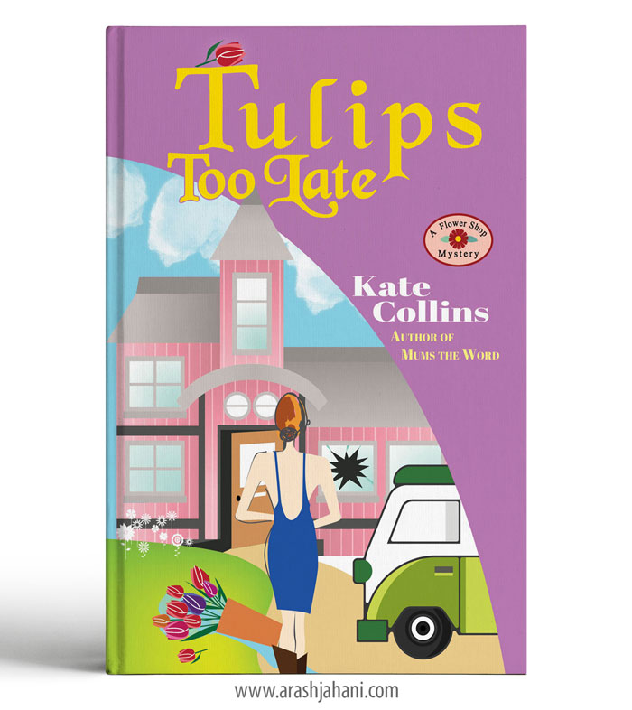
Purple is a combination of red and blue and incorporates the characteristics of both colors. Purple is mostly used as a color that shows creativity and imagination.
Purple light spectrums are also a sign of love and romantic relationships, and dark purple color spectrums are expressions of wealth and luxury.
Neutral colors
Neutral colors are often used as a background in book cover design, and usually, light colors are combined. Meanings and ideas of neutral colors are taken under the influence of warm and cold colors.
Black
Black is the strongest neutral color. Black is usually associated with power, elegance. On the negative side, it can be associated with evil, death, and mystery. Black is the traditional color of mourning in many countries. In design, black is commonly used for typography and other functional parts and texts because of its neutrality. Black has the ability to powerfully display its meaning and purpose among the various colors used around it in the design.
White
White can be applied to any other color. White means purity, cleanliness. Another sign of the purity of white is that angels are always shown to be white. In graphic design, white is generally a neutral background that allows other colors to be more central in a design, making the overall meaning of the design dependent on the colors used around it.
Gray
Gray is another neutral color that is generally at the bottom of the cool color spectrum. Its meaning and concept are also different; sometimes it can be a clear sign, and sometimes it is a sign of simplicity or depression.
Gray is generally considered a conservative and formal color. This color is commonly used in the designs of large and reputable companies and is a sign of mission and professionalism.
Brown
It is a brown color that originates from the nature and essence of the earth, soil, and stone and is also considered a neutral color. The brown color shows the concepts of reliability and stability in the designs, but the manner and amount of using this color in graphic design are also very sensitive, and not using the right brown color gives the viewer a feeling of tiredness and dullness.
Cream
The cream is a neutral and modern color that combines part of the warmth of the brown color used and most of it uses white. Cream colors are generally calm and can often evoke historical emotions.
If you like to read more articles about the designing click on the link below.
https://arashjahani.com/blog/
And also if you’re Looking for an experienced book designer, I am here to help with all of your needs. My goal as a designer is to provide high-quality work for budgets both big or small, while always keeping my client’s passion and feedback in mind.

